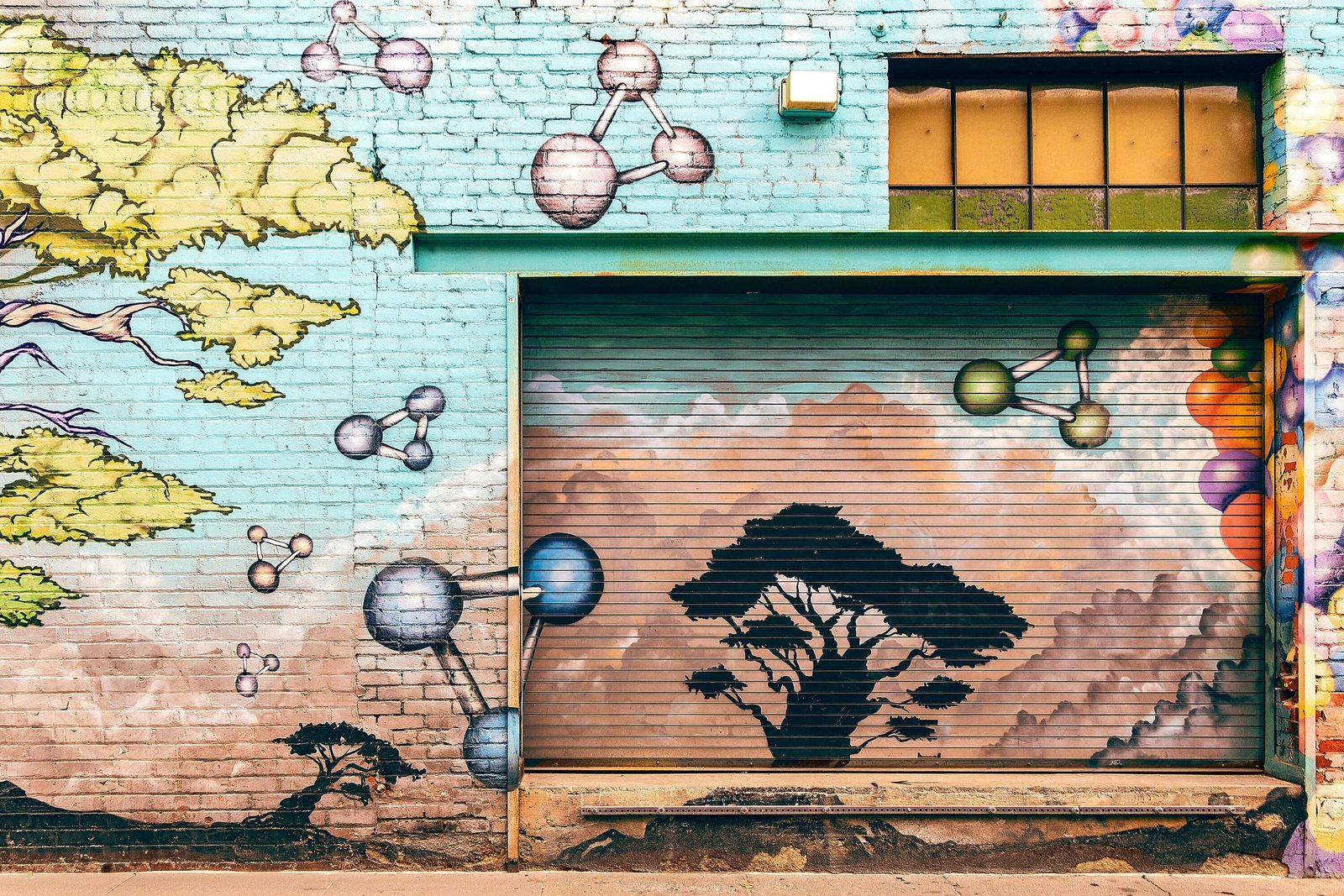
Why I Start Every 20-Meter Wall on a 12-Inch Screen
Traditionalists cringe when I mention the words “Procreate” and “fresco” in the same sentence, yet the tablet is my portable Sistine Chapel. Designing at 1∶20 scale forces clarity—every brush stroke must earn its pixel. I build compositions in nested groups: BG_Sky, FG_Figures, Accent_Gold. These aren’t just tidy layers; they become logistical checklists once scaffolding enters the picture. When the digital mock-up feels balanced, I export each group as high-contrast PNGs ready for projection. This pocket-to-plaza pipeline lets me gestate ideas on buses, in queues, even during dentist appointments, ensuring wall time is execution, not exploration.
The Projector Settings No One Tells You About
Paint Passes: Flat, Mid-Tone, Highlight—Always in That Order
I attack walls like Photoshop layers. First pass: lay opaque flats with household acrylic thinned 5 % with matte medium; the goal is coverage, not perfection. Second pass: add mid-tone gradients using 4-inch soft rollers for seamless skies. Third pass: highlights and line crisping with 1-inch filberts. Somewhere between pass two and three I livestream for patrons—social proof while the piece still looks ugly. By sunset of day three, the digital sketch and the brick facade are indistinguishable save for scale. When clients ask how long a 20-meter mural takes, I say ‘three iPad batteries and one sore neck,’ which is artist-speak for ‘about 26 hours.’